Input 2021.01.11 14:09


GM changed the logo from uppercase to lowercase and underlined the lowercase m to inherit the original GM logo design. At the same time, he visualized the’ultium platform’, GM’s new electric vehicle platform, and explained that the empty space around the lowercase m symbolizes the shape of an electric plug.
GM has changed its logo four times since its inception in 1938. The logo used immediately after the company was founded was created with the motif of the first corporate certificate in 1908, and it became the basis of today’s GM logo by writing down the initial letter of General Motors, GM in capital letters, and introducing a vertically arranged rectangle. Afterwards, in 1964, to make the logo more simple and clear, GM removed everything except GM, left only the underline under the letter, and changed the logo color from black to blue.
In 2001, the GM logo introduced a shadow effect in 3D to emphasize it to be more visible. The keynote of emphasizing the logo continued to the next version of the logo of the 2010s. After receiving government officials after bankruptcy in 2009, GM launched a new GM and unveiled a new logo to renew its image. It is the most familiar logo until recently by highlighting the central part of GM letters and emphasizing the letters with borders.

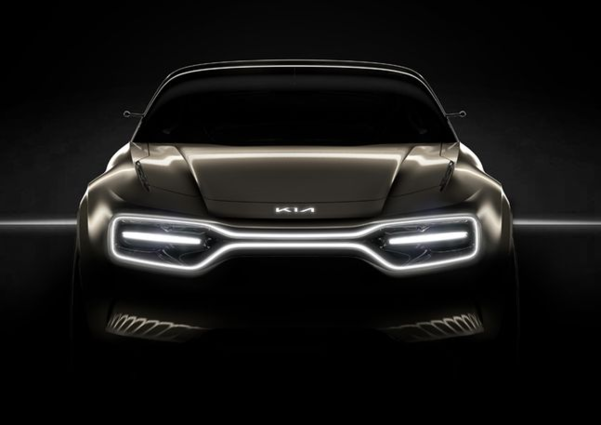
From 1953 to last year, Kia Motors has used a total of six logos. In 1944, with Kyungsung Precision Industries as the mother, Kia Industries began manufacturing bicycles and tricycles in 1952. This is the reason why the initial logo had a gear shape. Since then, Kia’s English’Kia’ has been used since 1986, and the red logo has been continued to emphasize vitality and initiative. On the 15th, Kia Motors is planning to present an image and vision for the new logo and concrete plans for the electric vehicle business.

Since then, Volkswagen has focused on developing de-internal combustion engines and electric vehicles for several years to clear the stigma. With this opportunity, Volkswagen launched’ID. With the release of 3′, a new two-dimensional blue logo has been unveiled. This was to break away from the image of Diesel Gate and establish an identity as an electric vehicle brand.
Nissan, Japan, which is suffering from the case of former chairman Carlos Gon and deteriorating business performance, has also changed its logo by unveiling a new electric vehicle. Former Nissan Motor Company Chairman Carlos Gon flees before trial on charges of embezzlement and malpractice in Japan, and Nissan raised an emergency fund of 1.5 trillion won with a guarantee from the Japanese government due to a serious business crisis.
Accordingly, in July of last year, Nissan unveiled a new logo after 19 years with a willingness to unveil and restore the new electric vehicle Ariya. According to Nissan, the circle surrounding the logo symbolizes’morning sun’ and the company name written in black symbolizes’sincerity’.
